Branding
Branding
Goldline Rebrand
Goldline Rebrand
Goldline Rebrand
001
001
001
Goldline was founded in 1923. For decades, that history was the brand. By 2023, it had become a liability — a name that read as outdated to the very clients it needed to attract. We were brought in to change that without erasing it.
Goldline was founded in 1923. For decades, that history was the brand. By 2023, it had become a liability — a name that read as outdated to the very clients it needed to attract. We were brought in to change that without erasing it.
Year
2025
Client
Goldline
Duration
14 weeks
Deliverables
Brand Identity, Art Direction, Brand Strategy
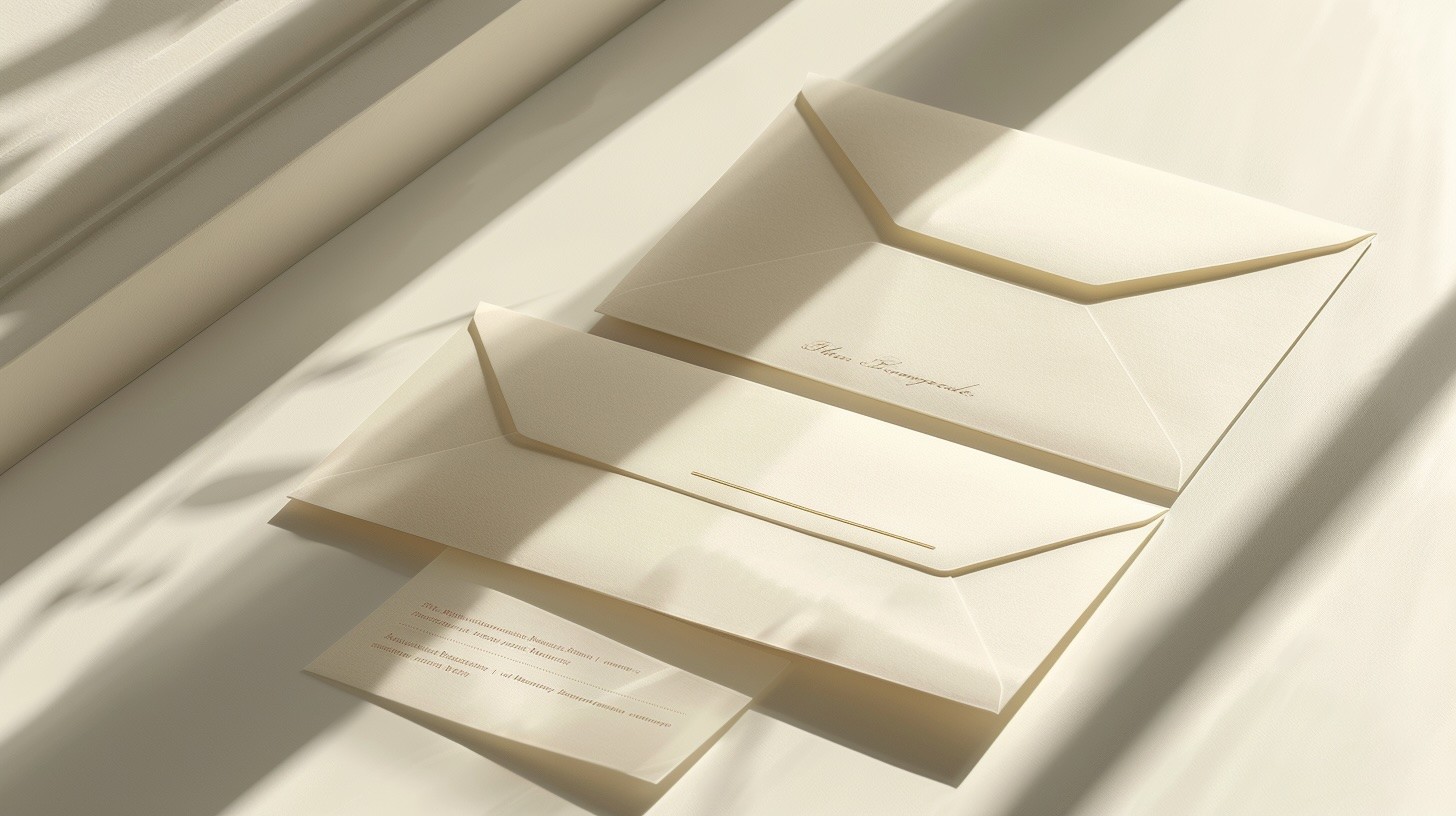
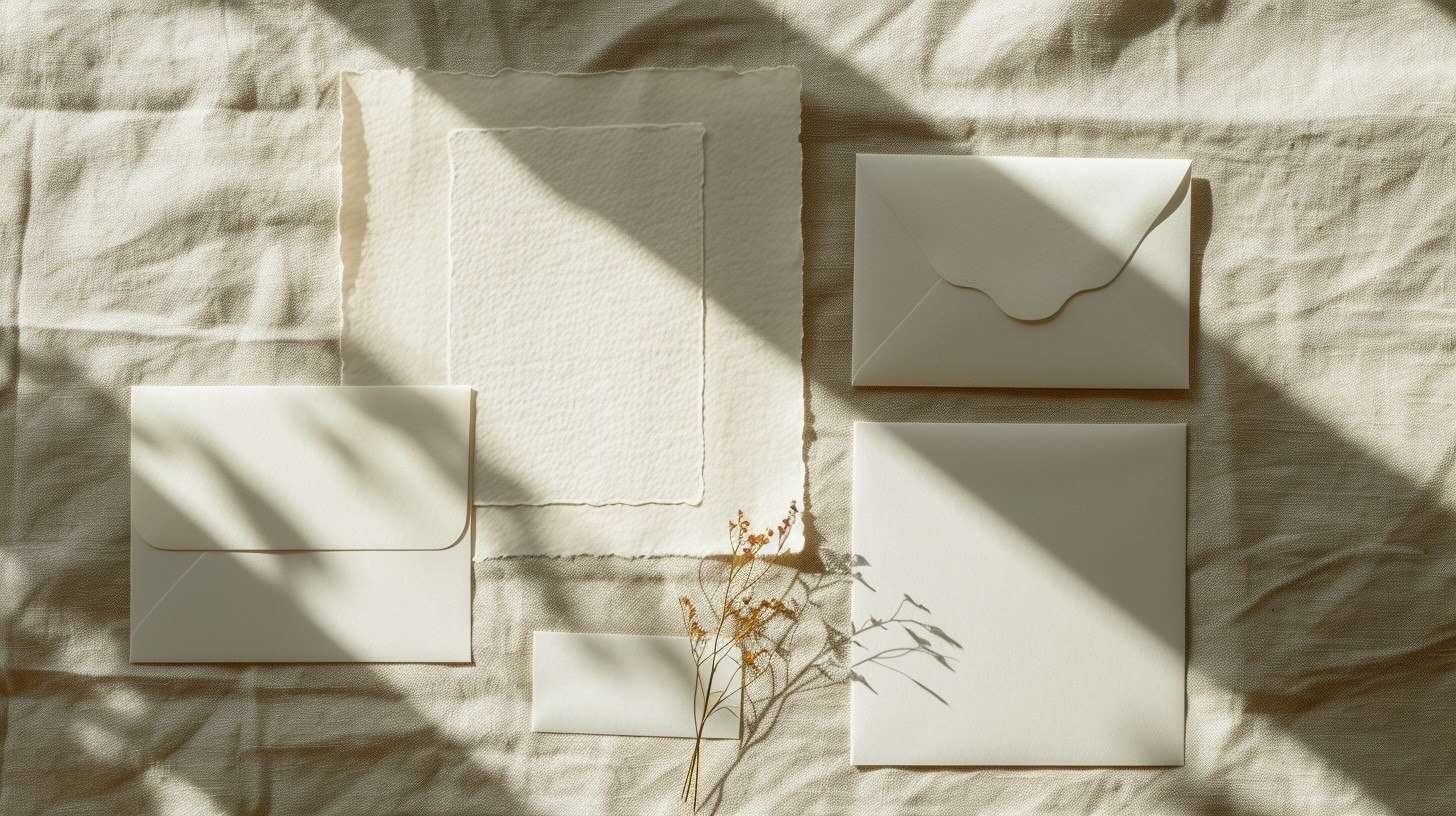
FIG. 01 — BRAND IDENTITY SYSTEM OVERVIEW
Challenge
A century of heritage is an asset. Until it isn't. Goldline's visual identity had accumulated layers of decisions made by different hands over different decades. The result was a brand that felt inconsistent, apologetic, and invisible in a market where their competitors had moved fast and looked sharp. The brief was clear : modernise without abandoning. Retain the equity, lose the weight.
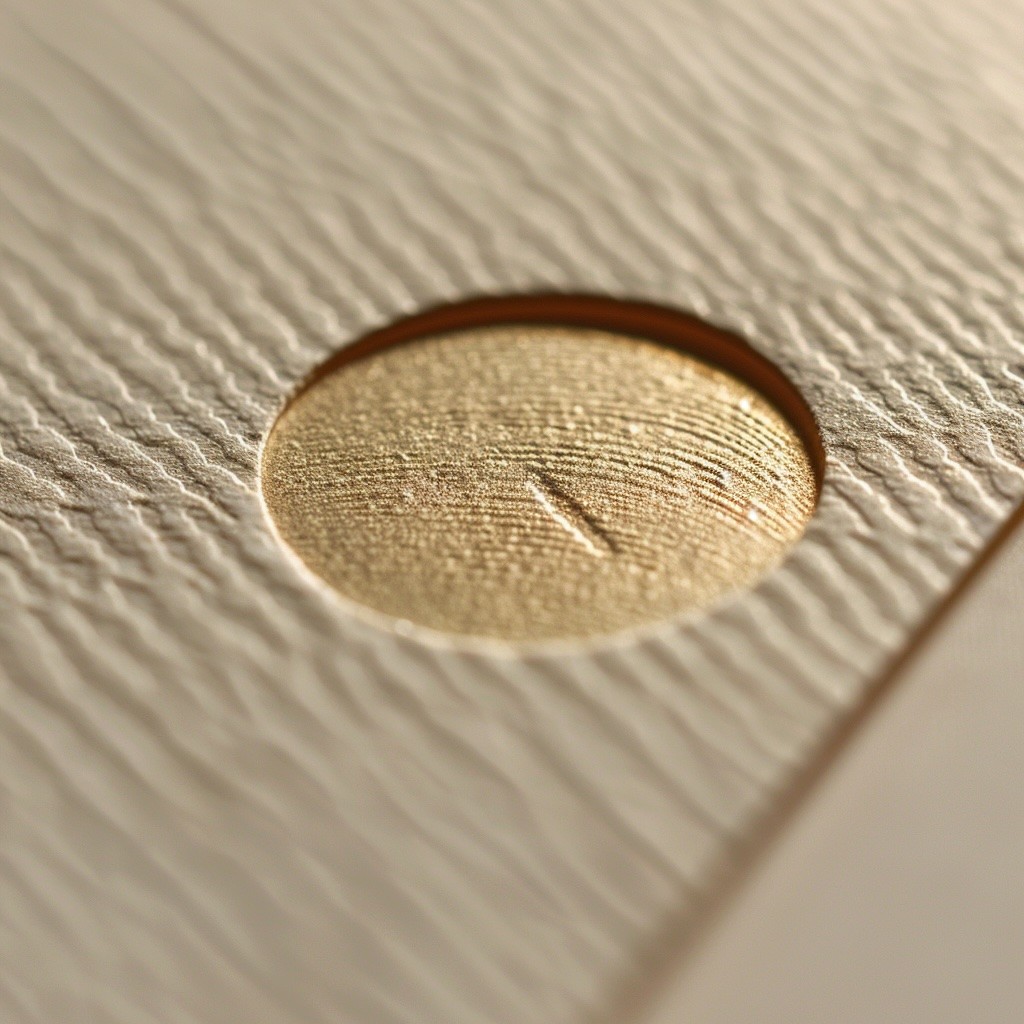
FIG. 02 — STATIONERY & PRINT COLLATERAL
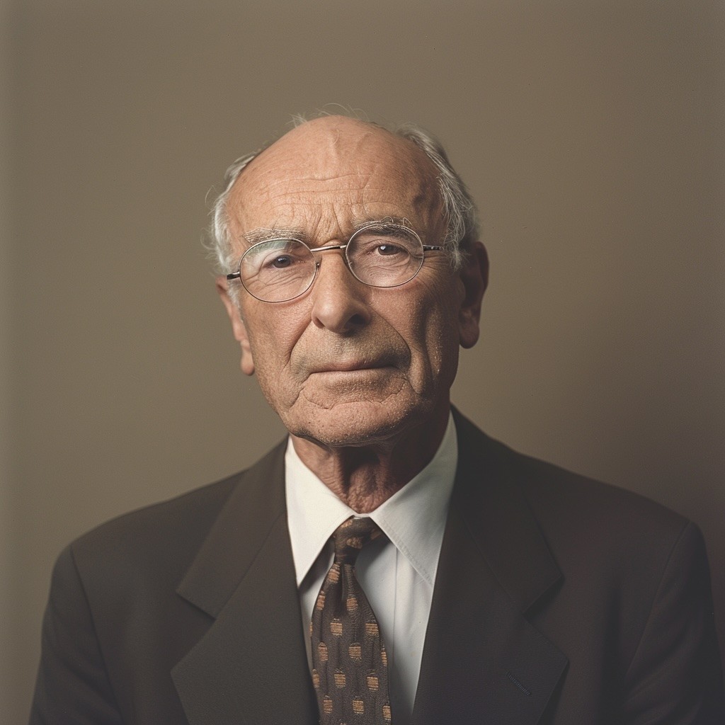
FIG. 03 — CLIENT PORTRAIT
Idea
We stripped everything back to one question : what is the one thing Goldline has that no challenger brand ever will ? Time. We built the new identity around the idea of accumulated precision — the craft that only comes from doing something for a hundred years. The logomark references a single gold bar, abstracted into a geometric mark that works at any scale. The typographic system pairs a sharp grotesque with a custom serif drawn from the proportions of the original 1923 wordmark. The palette stays anchored in gold — but a gold that earns its place rather than demands it.
"They didn't rebrand us — they gave us permission to become what we always were."
"They didn't rebrand us — they gave us permission to become what we always were."
Matteo Ferrara
CEO · Goldline

FIG. 04 — BRAND GUIDELINES DOCUMENTATION
conclusion
Six months after launch, Goldline reported a 40% increase in qualified inbound leads and closed their largest contract in eleven years. The new identity is now live across 14 markets. Sometimes the oldest brands just need permission to become what they always were.
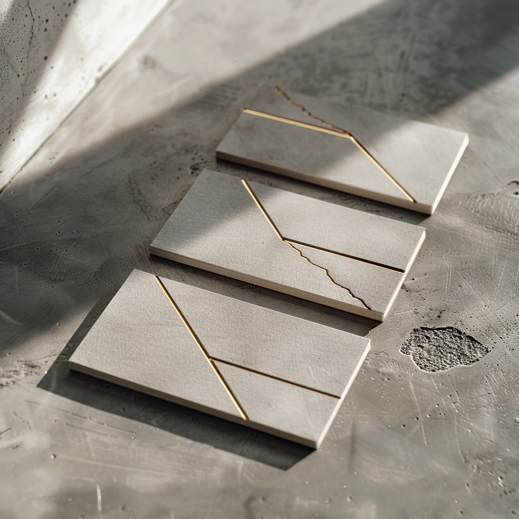
FIG. 05 — BUSINESS CARD SYSTEM
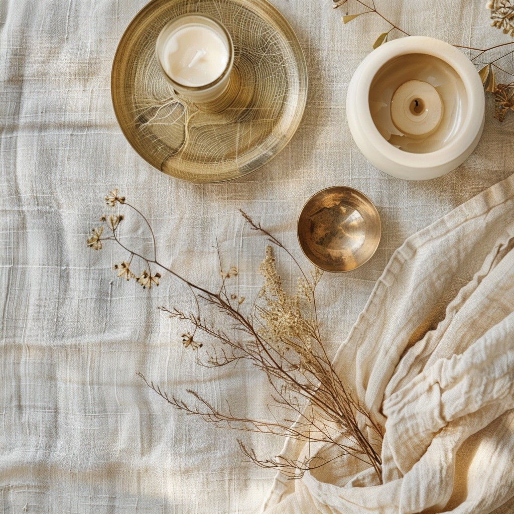
FIG. 06 — FINAL BRAND APPLICATION
+40%
Qualified leads
14
14
Markets live
$4.2M
$4.2M
Largest leads
6mo
6mo
Post launch
Creative Direction
Nicolas A.
Brand Strategy
Mara Bauer
Design
Selin Park
Motion
James Osei
Photography
Lukas Venn

Branding
Branding
Goldline Rebrand
Goldline Rebrand
Goldline Rebrand
001
001
001
Goldline was founded in 1923. For decades, that history was the brand. By 2023, it had become a liability — a name that read as outdated to the very clients it needed to attract. We were brought in to change that without erasing it.
Goldline was founded in 1923. For decades, that history was the brand. By 2023, it had become a liability — a name that read as outdated to the very clients it needed to attract. We were brought in to change that without erasing it.
Year
2025
Client
Goldline
Duration
14 weeks
Deliverables
Brand Identity, Art Direction, Brand Strategy
FIG. 01 — BRAND IDENTITY SYSTEM OVERVIEW
Challenge
A century of heritage is an asset. Until it isn't. Goldline's visual identity had accumulated layers of decisions made by different hands over different decades. The result was a brand that felt inconsistent, apologetic, and invisible in a market where their competitors had moved fast and looked sharp. The brief was clear : modernise without abandoning. Retain the equity, lose the weight.
FIG. 02 — STATIONERY & PRINT COLLATERAL
FIG. 03 — CLIENT PORTRAIT
Idea
We stripped everything back to one question : what is the one thing Goldline has that no challenger brand ever will ? Time. We built the new identity around the idea of accumulated precision — the craft that only comes from doing something for a hundred years. The logomark references a single gold bar, abstracted into a geometric mark that works at any scale. The typographic system pairs a sharp grotesque with a custom serif drawn from the proportions of the original 1923 wordmark. The palette stays anchored in gold — but a gold that earns its place rather than demands it.
"They didn't rebrand us — they gave us permission to become what we always were."
"They didn't rebrand us — they gave us permission to become what we always were."
Matteo Ferrara
CEO · Goldline
FIG. 04 — BRAND GUIDELINES DOCUMENTATION
conclusion
Six months after launch, Goldline reported a 40% increase in qualified inbound leads and closed their largest contract in eleven years. The new identity is now live across 14 markets. Sometimes the oldest brands just need permission to become what they always were.
FIG. 05 — BUSINESS CARD SYSTEM
FIG. 06 — FINAL BRAND APPLICATION
+40%
Qualified leads
14
14
Markets live
$4.2M
$4.2M
Largest leads
6mo
6mo
Post launch
Creative Direction
Nicolas A.
Brand Strategy
Mara Bauer
Design
Selin Park
Motion
James Osei
Photography
Lukas Venn