Web design
Web design
Forma Digital
Forma Digital
Forma Digital
002
002
002

Forma came to us with a product that worked and a website that didn't. Their platform helps architecture firms manage complex project documentation — powerful software, invisible brand. They needed a digital presence that matched the sophistication of what they'd built.
Forma came to us with a product that worked and a website that didn't. Their platform helps architecture firms manage complex project documentation — powerful software, invisible brand. They needed a digital presence that matched the sophistication of what they'd built.
Year
2024
Client
Forma Digital
Duration
10 weeks
Deliverables
Web Design, UI/UX, Art Direction

FIG. 01 — SITE ARCHITECTURE & UX MAPPING
Challenge
B2B software is a crowded space where most websites look the same — dark backgrounds, glowing UI screenshots, generic claims about "streamlining workflows." Forma's actual product was genuinely elegant. The challenge was translating that into a web experience that felt as considered as the software itself, without falling into the visual clichés of the category.
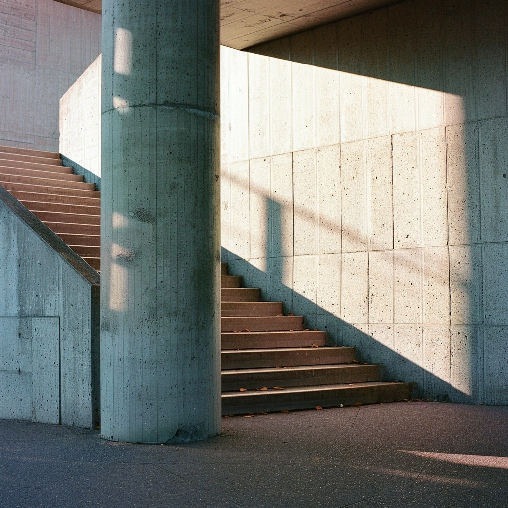
FIG. 02 — STRUCTURAL REFERENCE STUDY

FIG. 03 — CLIENT PORTRAIT — HEAD OF PRODUCT
Idea
We looked at what architecture firms actually value : precision, materiality, the relationship between structure and space. The site was built around those ideas. A restrained palette of warm white and deep charcoal. Typography that breathes. Product screenshots treated as objects — framed, considered, never dumped on the page. The navigation was redesigned from the ground up to reflect how architects actually think : by project type, not by feature set. Every interaction was kept intentional. No scroll-jacking, no auto-playing video. Just a site that respects the intelligence of the people using it.
We went into the first call expecting to explain our product. They already understood it.
We went into the first call expecting to explain our product. They already understood it.
Lena Hartmann
Head of Product, Forma Digital
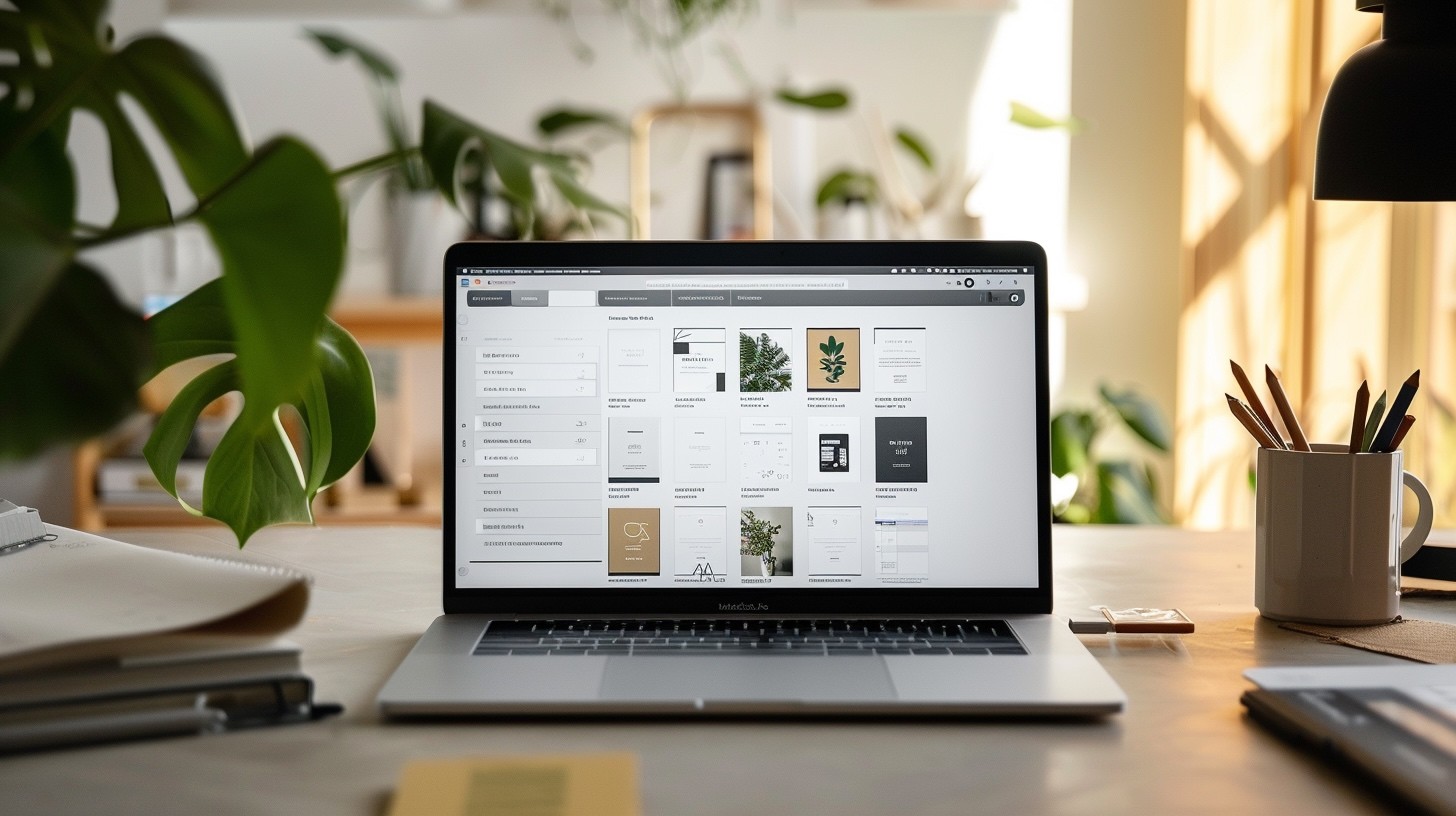
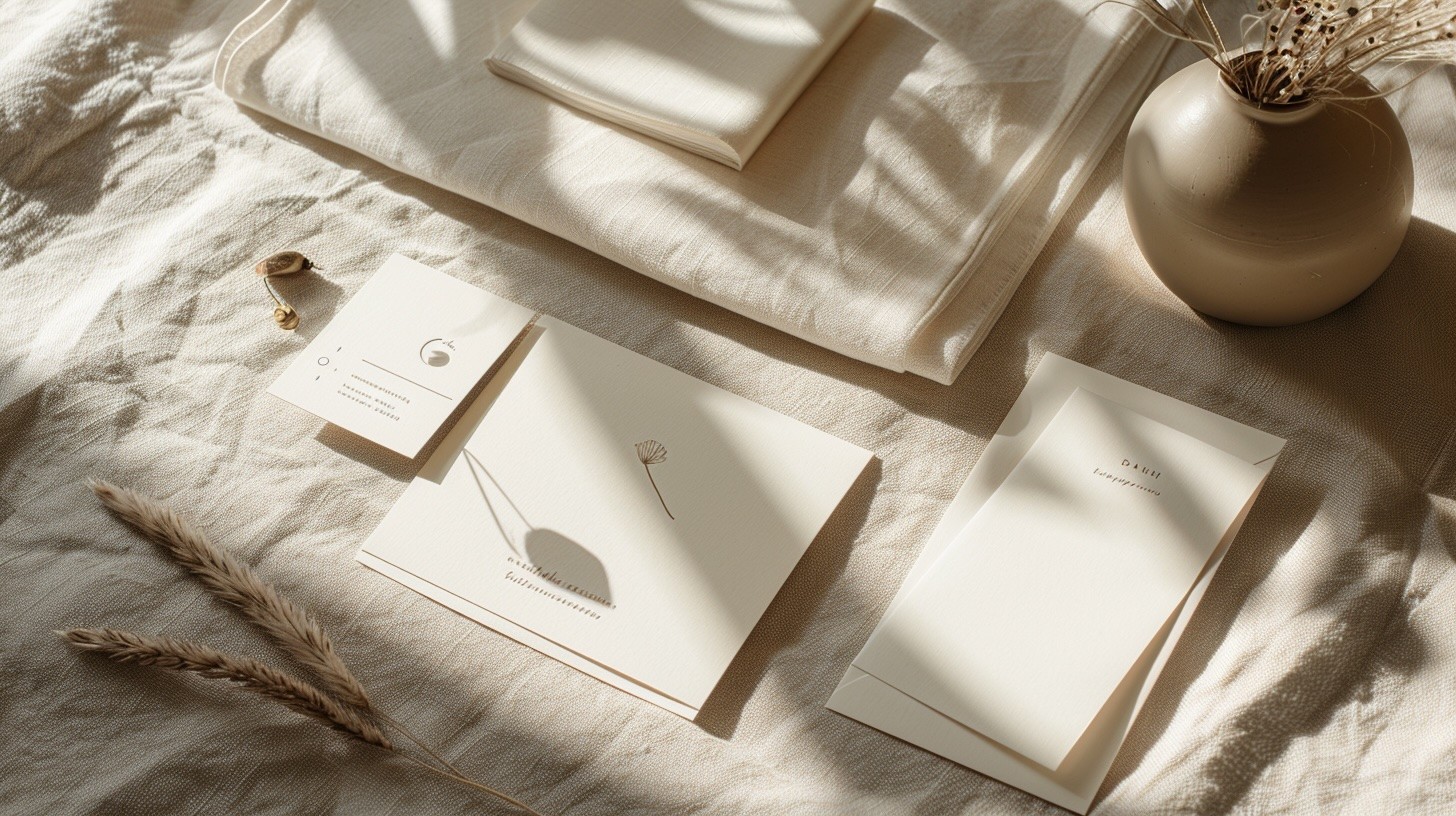
FIG. 04 — UI COMPONENT LIBRARY
conclusion
The site launched in Q1 2024. Within 90 days, demo request conversion increased by 65% — prospects were arriving to sales calls already convinced. Average session duration doubled. The sales team stopped explaining the product and started closing deals. That's what happens when the website does the first meeting for you.

FIG. 05 — RESPONSIVE LAYOUT EXPLORATION
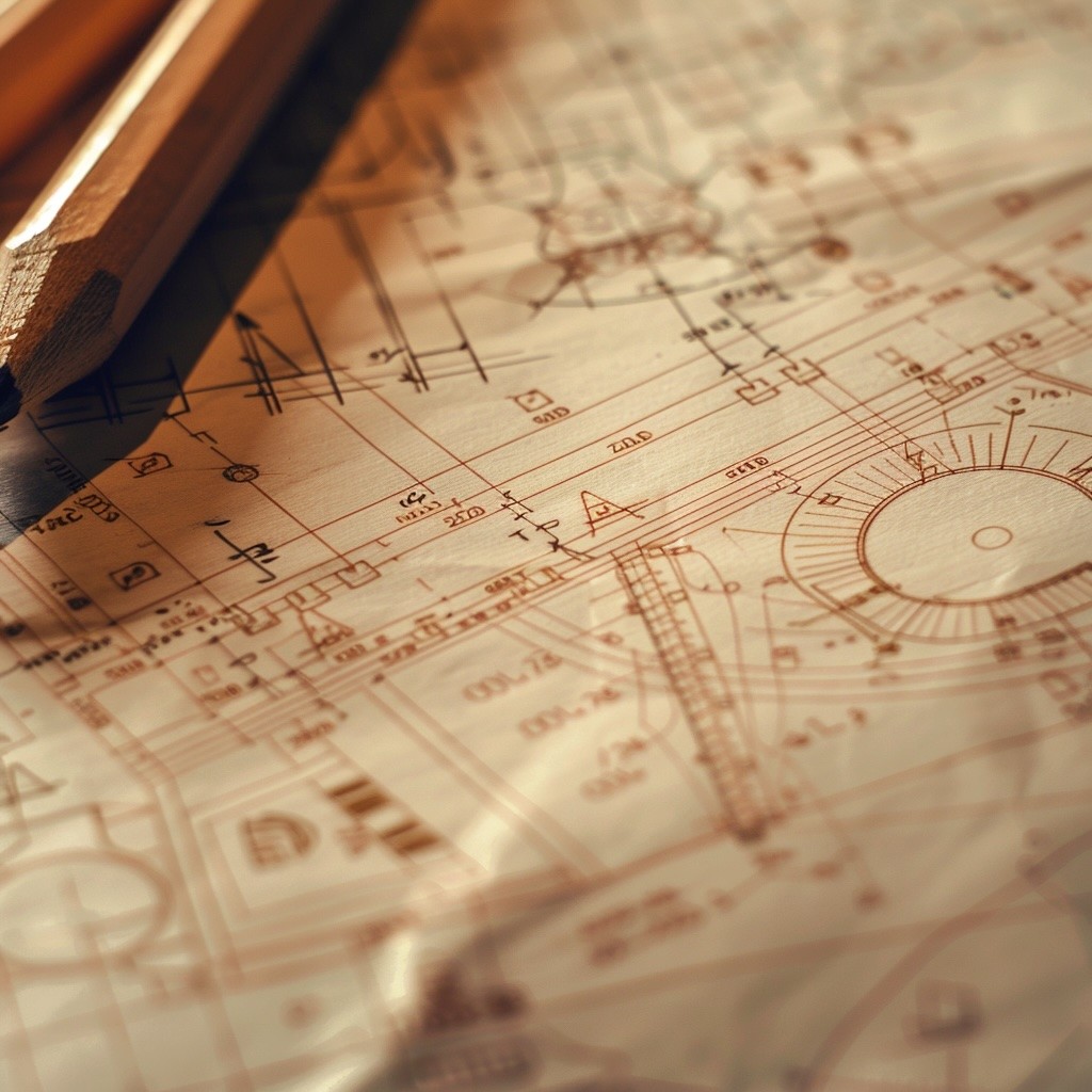
FIG. 06 — FINAL INTERFACE DETAIL
+65%
Demo conversions
2x
2x
Session duration
90
90
Days to results
Q1 24
Q1 24
Launch date
Creative Direction
Nicolas A.
UX design
Selin Park
UI design
Lena Chen
Art direction
Mara Bauer
Development
Tobias Ruhl
Web design
Web design
Forma Digital
Forma Digital
Forma Digital
002
002
002
Forma came to us with a product that worked and a website that didn't. Their platform helps architecture firms manage complex project documentation — powerful software, invisible brand. They needed a digital presence that matched the sophistication of what they'd built.
Forma came to us with a product that worked and a website that didn't. Their platform helps architecture firms manage complex project documentation — powerful software, invisible brand. They needed a digital presence that matched the sophistication of what they'd built.
Year
2024
Client
Forma Digital
Duration
10 weeks
Deliverables
Web Design, UI/UX, Art Direction
FIG. 01 — SITE ARCHITECTURE & UX MAPPING
Challenge
B2B software is a crowded space where most websites look the same — dark backgrounds, glowing UI screenshots, generic claims about "streamlining workflows." Forma's actual product was genuinely elegant. The challenge was translating that into a web experience that felt as considered as the software itself, without falling into the visual clichés of the category.
FIG. 02 — STRUCTURAL REFERENCE STUDY
FIG. 03 — CLIENT PORTRAIT — HEAD OF PRODUCT
Idea
We looked at what architecture firms actually value : precision, materiality, the relationship between structure and space. The site was built around those ideas. A restrained palette of warm white and deep charcoal. Typography that breathes. Product screenshots treated as objects — framed, considered, never dumped on the page. The navigation was redesigned from the ground up to reflect how architects actually think : by project type, not by feature set. Every interaction was kept intentional. No scroll-jacking, no auto-playing video. Just a site that respects the intelligence of the people using it.
We went into the first call expecting to explain our product. They already understood it.
We went into the first call expecting to explain our product. They already understood it.
Lena Hartmann
Head of Product, Forma Digital
FIG. 04 — UI COMPONENT LIBRARY
conclusion
The site launched in Q1 2024. Within 90 days, demo request conversion increased by 65% — prospects were arriving to sales calls already convinced. Average session duration doubled. The sales team stopped explaining the product and started closing deals. That's what happens when the website does the first meeting for you.
FIG. 05 — RESPONSIVE LAYOUT EXPLORATION
FIG. 06 — FINAL INTERFACE DETAIL
+65%
Demo conversions
2x
2x
Session duration
90
90
Days to results
Q1 24
Q1 24
Launch date
Creative Direction
Nicolas A.
UX design
Selin Park
UI design
Lena Chen
Art direction
Mara Bauer
Development
Tobias Ruhl